Source: LinkedIn.
A LinkedIn post is going gangbusters, as entrepreneurs, marketing experts and designers debate the design of one “genius” business card.
On Thursday, Aussie writer and founder of media agency Hustlr, Daniel Abrahams, shared an image of a business card, praising its “genius design”.
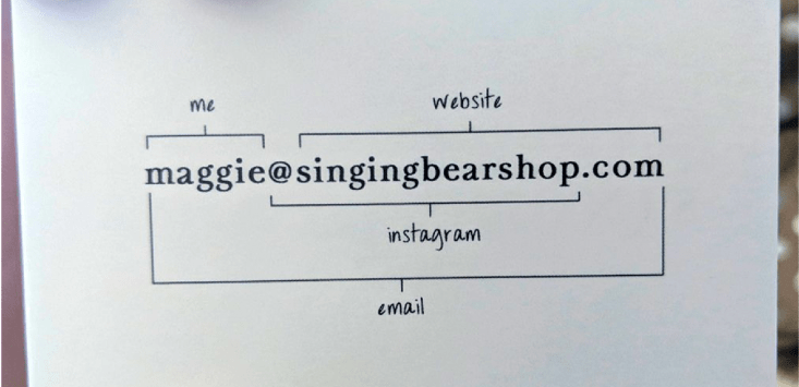
The business card features the email address of Maggie High, the owner of San Francisco-based baby bib retailer Singing Bear.
The email address is annotated, highlighting the ‘@singingbearshop’ part as the brand’s Instagram handle, the ‘singingbearshop.com’ part as the website.
The ‘Maggie’ part is labelled, simply, ‘me’.
At the time of writing, Abrahams’ post has more than 126,000 reactions and 2,350 comments.
Many commenters echo his thoughts, calling the business card’s design “so clean”, “perfect” and “gorgeous”, and stating “simplicity always wins”.
One marketing graphic designer called it “the most brilliantly simplistic marketing piece I’ve seen in a while”.
However, this is the internet. And, of course, not everyone was quite so full of praise.
Some noted that information that is typically included on a business card is missing here — a surname, a phone number, or any indication of what the business does, for example.
This only leads to more questions. Most pressingly: is there more information on the back?
But also, does this business owner want to share these details? Her target audience is the parents of young children — likely millennials. These are people who like to connect digitally, at least at first.
One commenter even joked: “Where is the fax number?”
Others asked who is actually still using business cards these days, with some pointing out the environmental drawbacks of printing them, when so many are ultimately thrown away.
In response, commenters noted that the design works just as well in a digital format. It has certainly caught the attention and the imagination of the masses on LinkedIn, at least.
Finally, some people simply weren’t on board with the design itself, suggesting the card is “way too busy”, or that it “doesn’t motivate me to find out more”.
One commenter, a UX architect, said this was a classic case of ‘form over function’.
“This a novelty that sacrifices usefulness for momentary delight,” they said.
SmartCompany reached out to High herself, but at the time of writing, we haven’t received a response.
Is it a good design or a bad one? Genius or foolhardy? A tactful marketing campaign tuned in to the client base, or something that took off unexpectedly?
One thing’s for sure, any business that’s generating this much attention, and getting its deets across so many LinkedIn feeds, must have done something right.
Handpicked for you

How one business got its Facebook page restored, and why its owner is rethinking her social media strategy


COMMENTS
SmartCompany is committed to hosting lively discussions. Help us keep the conversation useful, interesting and welcoming. We aim to publish comments quickly in the interest of promoting robust conversation, but we’re a small team and we deploy filters to protect against legal risk. Occasionally your comment may be held up while it is being reviewed, but we’re working as fast as we can to keep the conversation rolling.
The SmartCompany comment section is members-only content. Please subscribe to leave a comment.
The SmartCompany comment section is members-only content. Please login to leave a comment.