
Australia’s company and financial services watchdog has splashed the cash on a new font and logo, hoping to rebrand itself post-royal commission as “respected” and “accountable”.
However, it seems the regulator might have some work left to do in that regard, as the refreshed branding has been laughed at by Australians due to its apparent simplicity and eye-watering cost.
The ABC reports Australia’s Securities and Investments Commission (ASIC) reportedly spent over $100,000 on a branding refresh, tendering a Sydney-based graphic design firm to create a logo for the company which was “finger-on-the-pulse, contemporary, informed”.
This week, ASIC unveiled the best logo one hundred grand can buy, but Australians were left scratching their heads.
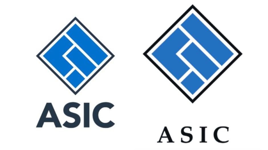
On the left, the new logo. On the right, the old logo. Source: Twitter.
According to the ABC, $43,000 of taxpayer money was spent on “creative development” for the logo, and an additional $60,000 was spent on “design and asset development”, such as new stationery.
While no one can appreciate a good branding refresh more than Australia’s savvy small-business owners, to the untrained (and possibly trained) eye, ASIC’s new logo looks like nothing more than a bold new font and a downsized, perhaps slightly darker logo.
Australians agreed, skewering ASIC on Twitter.
ASIC: We need a new logo, something powerful.
Designer: How about we just bold ASIC?
ASIC: Perfect, how much?
Designer: $100,000.
ASIC: It's a deal.https://t.co/DsfUNNzkwQ
— Brent Ford (@BrentFord26) February 12, 2019
Hey Australian government, the $100k for the ASIC logo could have been far better spent. https://t.co/DwRzlfyI9I
— Carly Findlay OAM (she/her) (@carlyfindlay) February 12, 2019
However, government departments spending thousands on new graphics is nothing new, with numerous tenders being awarded to Australian design firms for similar work.
But ASIC’s tough new redesign lands at an unfortunate time for the watchdog, which was recently slammed by the banking royal commission’s final report for being too soft on banks and having an aversion to pressing charges. Undertaking a logo redesign in the middle of the royal commission has been called out by branding experts as a questionable move at best.
“Instead of working to throw the book at the banks, they were more concerned about the font that book was written in,” Labor’s Matt Keogh told the ABC.
In a statement to SmartCompany, senior executive leader of corporate affairs at ASIC Matthew Abbott said the overhaul was necessary because the font had not been changed in over 20 years.
“ASIC’s branding update was about making sure ASIC’s materials are suitable for digital channels — and digital is what the people ASIC regulates use,” he said.
Earlier this week, the Department of Innovation told SmartCompany it would no longer be supporting Australia’s largest survey of startups due to it no longer meeting the department’s “value for money principles”. We wonder if such principles were considered in ASIC’s case.
NOW READ: Hayne balks at calls for SME-lending reform and deputises ASIC as code cop
NOW READ: Phoenixing tax dodger lands six years in jail and $1.8 million fine


COMMENTS
SmartCompany is committed to hosting lively discussions. Help us keep the conversation useful, interesting and welcoming. We aim to publish comments quickly in the interest of promoting robust conversation, but we’re a small team and we deploy filters to protect against legal risk. Occasionally your comment may be held up while it is being reviewed, but we’re working as fast as we can to keep the conversation rolling.
The SmartCompany comment section is members-only content. Please subscribe to leave a comment.
The SmartCompany comment section is members-only content. Please login to leave a comment.